Divergent Stacked Bar Chart
How to Make a Diverging Stacked Bar Charts in Excel, from the Scratch
The word divergent means tending towards different directions. In the context of
graphical representation of ideas or data, diverging stacked bar chart depicts
differences in opinions or disagreements about certain issue. It also presents
the proportion of the different opinions or disagreements. The type you are going to learn to develop here is the diagram below.
Figure 1

Why? A diverging stacked bar chart enhances the comparison of multiple categories. It's way of design helps to compare proportion in a specific diverse number of categories.
How? The diverging stacked bar chart is an extension of the horizontal bar chart. Each bar is segmented into rectangular fragments stacked one after the other. And every fragment represent a specific percentage of the bar to make a 100% stacked bar.
So what? The diverging stacked bar chart are commonly used to present the results of survey designed collected using the Likert scale. The Likert scale is a psychometric scale commonly used for scaling responses in survey data. The segments showing positive responses tend towards the right of the center line while segments representing negative responses tend towards the left of the center line. Example of Likert scale used for research or program evaluation data collection includes: strongly disagree, disagree, somewhat disagree, somewhat agree, agree, and strongly agree.
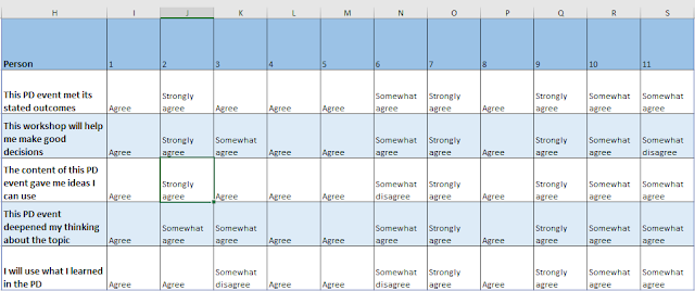
The survey result that I will be analyze here was collected to assess the perceptions of eleven professionals about their experiences in a professional development program. Table 1 is the raw data set.

Using the Microsoft excel formula TRANSPOSE(A1:F12) in a any empty cell on
the same spread sheet, you would get Table 2 (Note that A1:F12 is the range
of cells the data occupied on the excel sheet)


You can now remove the legend and title box of the graph to get what you see in Figure 7. (You get to that, when you right click on the legend and title box individually, and then select option "Delete")

At this stage, you proceed to enlarge each bar in the graph. First right click on any of the bars and select "Format Data Series", as you see in Figure 8. Then a "Format Data Series" table pops up at the left side of your screen.


Once that is done, delete all the 0% and all the values assigned to the two
buffers at both extreme ends of each bar.


The next step in constructing the graph is to construct the key that would make it easier for readers to decipher how survey respondents answered each question. This step is achieved by simply typing the six options and selecting the matching colors.


On a final note, the graph (Figure 18) can be made bigger or smaller by
simply adjusting the size and a snap shot of it, can be transferred to
power-points slide, word document, or any other documents for reporting or
presentation purposes.

Why? A diverging stacked bar chart enhances the comparison of multiple categories. It's way of design helps to compare proportion in a specific diverse number of categories.
How? The diverging stacked bar chart is an extension of the horizontal bar chart. Each bar is segmented into rectangular fragments stacked one after the other. And every fragment represent a specific percentage of the bar to make a 100% stacked bar.
So what? The diverging stacked bar chart are commonly used to present the results of survey designed collected using the Likert scale. The Likert scale is a psychometric scale commonly used for scaling responses in survey data. The segments showing positive responses tend towards the right of the center line while segments representing negative responses tend towards the left of the center line. Example of Likert scale used for research or program evaluation data collection includes: strongly disagree, disagree, somewhat disagree, somewhat agree, agree, and strongly agree.
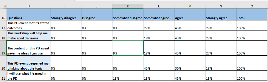
The survey result that I will be analyze here was collected to assess the perceptions of eleven professionals about their experiences in a professional development program. Table 1 is the raw data set.
Table 1

Table 2
After you have successfully transposed (switched the row to column and vice
versa) table 1 to become table 2. You will have to create another table
(Table 3) with eight columns. The first column will be for the questions,
the next six columns contain the six possible Likert scale used during the
data collection strongly disagree, disagree, somewhat disagree, somewhat
agree, agree, and strongly agree. And the last column will be for the total
number of people who responded to each question.
Table 3
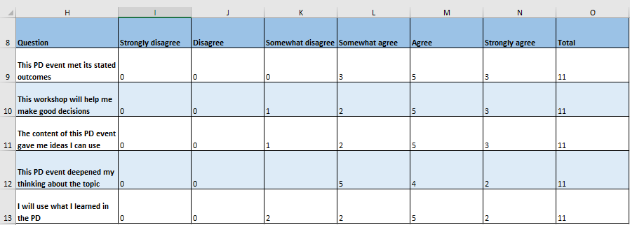
For the next step, try to compute the percentage of persons that selected
each of the six Likert scale options for all the five questions, i.e.,
compute the percentage of each cell, by using the row total, which is the
sum of the people that responded to each question (see Table 4). The excel
can compute the percentage of responses in each cell. For example, cell L17
is computed from Table 3, using the formula, "=5/11" or "=L17/O17". To get
the percentage of each cell, highlight the entire table and click on the
icon "%" that is displayed on the ribbon, situated on top of the excel
sheet.
Table 4
For the next step, you get rid of the total column and add two columns to
the Table 4, to get Table 5. The two column are named buffer 1 and 2. One
will be added before the first Likert scale option and the other will be
added after the last Likert scale option. The purpose of the buffer is to
ensure uniform midpoint for all the bars that would be generated through the
data points. While buffer 1 (the buffer at the left) is computed by
subtracting 1 from the three column at the left, buffer 2 (the buffer at the
right) is computed by subtracting 1 from the three column at the right (see
the formula displayed in Table 5).
Table 5

Now that we have the two buffers, and all the data converted to percentages,
we can then highlight the entire Table 5, and click on the "insert" that is
displayed on the ribbon, situated on top of the excel sheet. Click on the
horizontal bar, click the 100% stacked bar (the third bar from the left),
select the one that displayed the questions asked in the data collection as
the vertical axis, and click "OK" (see Figure 2).
Figure 2

When you click "OK", the left side 100% stacked bar you selected will be
displayed on the same sheet (see Figure 3).
Figure 3

Then you proceed to change the colors of the two buffers to white (i.e.,
Buffer 1 and Buffer 2), and also remove the graph's grid line. To remove the
grid line from the graph, you have to right click on any of the grid lines
and select "Delete" (see Figure 4)
Figure 4

To change Buffer 1 to white, identify any of the bars that has parts of its
color components matching with Buffer 1, and specifically right click on the
portion of the bar with the target color. A list of option immediately pops
up, where you can select "Format Data Series" (see Figure 5).
Figure 5

As soon as you select the "Format Data Series" option, you will see a
table pop-up at the left side of your screen with the title
"Format Data Series". Click on the paint bucket under the "Series Options", and then proceed by
clicking on the paint bucket that immediately pops-up beneath. The next is
for you to change Buffer 1 color by selecting a white color among all other
colors displayed in the pallet (see Figure 6). Just as you have done for
Buffer 1, do likewise to Buffer 2, in order to make the two of them become
invisible on the excel sheet.
Figure 6

You can now remove the legend and title box of the graph to get what you see in Figure 7. (You get to that, when you right click on the legend and title box individually, and then select option "Delete")
Figure 7

At this stage, you proceed to enlarge each bar in the graph. First right click on any of the bars and select "Format Data Series", as you see in Figure 8. Then a "Format Data Series" table pops up at the left side of your screen.
Figure 8

Change the "Gap Width" to 25% and press "enter" on your keyboard.
Then you will notice the width of the bar get wider (see changes in Figure 9).
Figure 9

The next thing at this point is to change the colors of each option in the
Likert scale to match the context of what the scale is trying to measure,
depending on how you want it to look like. In this case, the Likert scale is
trying to identify proportion of people who agreed or disagreed to the
questions asked. So, I will like to use different blue colors for agreement
part and different versions of red colors for the disagreement part. To do
that, I will follow the same steps that I used to change the two Buffers to
color white in Figure 5, by simply selecting from ranges of deep blue
and red colors to ranges of faded versions of the same colors. Note that the
choice of colors here was carefully ordered to allow for noticeable
visualization of the divergent inherent in the survey responses (see Figure 10).
Figure 10

Now that I have the desired colors, the next thing will be to add data
labels to the chart. And that is easily be done through a right click on any
of the bar. The moment a list of option pops-up, select the "Add Data
Labels" options to make labels appear for each section of the bars.
Figure 11

You can drag the bar chart down a little bit to create more space for the
chart title or simply tick "Chart Title" to have the title in the
available space. Also tick the "Data Labels" option to add the
percentage of each option. Note that the Chart Element will appear as
soon as you click on any part of the chart.
Figure 12

Figure 13

One can proceed to change the dark colors of the data labels or make the
prints look bolder by simply selecting the options available at the upper
ribbon of the excel page (see Figure 14).
Figure 14

At this point, you proceed by giving the chart any title you think is
appropriate and then remove the line separating the bars from the questions
asked in the survey (this is optional), to generate the new look in the next
graph.
Figure 15

The next step in constructing the graph is to construct the key that would make it easier for readers to decipher how survey respondents answered each question. This step is achieved by simply typing the six options and selecting the matching colors.
Figure 16

To get a uniform background, highlight the cells surrounding the graph and
select white color displayed on the top ribbon of the excel page.
Figure 17

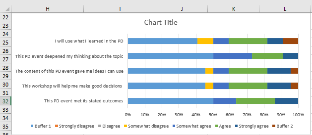
Figure 18
Apparently, the end result of the graph depicts that majority of the survey
respondents had positive perceptions towards most part of the PD event.
Except for questions 2, 3, & 5, where at least 9% (i.e., at least one
person out of a total of 11 participants) slightly disagreed about how the
PD impacted their skills/how they intend to use the skills gained during the
PD. All other responses ranged between strongly agree and somewhat agreed.
Ultimately, this is an indication that the event is beneficial to the
participants, and may only need some adjustments/work to ensure that all
participants fall within the range of strongly agree and agree in the
future.
Video
You can watch this video to follow through on how to develop all the processes explained in this post. (Available on the Quantitative Datanalysis YouTube channel)
Conclusion: A recap of the steps taken to develop the divergent bar chart above in excel is summarized as follows:
step 1-- Download the dataset either in text or numeric format
step 2-- Assign values each to all possible options, if you downloaded
your dataset in text format
step 3-- Compute the percentage of respondents that selected each option
for individual question
step 4-- Highlight the table with the percentages and choose the 100%
stacked bar chart
step 5-- Establish the midpoint of each bar by creating buffers at both
extreme ends
step 6-- Choose two different colors and ensure they diverge from the
center to both ends, specifically changing from light to dark
step 7-- Make the chart easier to understand for readers by featuring the
chart title, data labels and legend that specifies the color match for
each option.
Finally, I hope you find this post helpful and please remember to share your thoughts or feedback about the content you have read so far.
This is quite helpful
ReplyDelete